Today I read a fascinating although tragic article on the investigation of the Air France Flight 447 crash of 2009. Early in the morning on June 1st, the Air France flight from Rio de Janeiro to Paris crashed in a storm, somewhere in the ocean between Brazil and Africa. It took days for them to find the aircraft and its 228 passengers, of which there were no survivors, and years to find the flight recorders. Finally, these flight recorder have revealed the pilots’ last conversations and they struggled to recover control of the aircraft.
Design Changes and Disaster

What they found was that Airbus‘ newer cockpit design makes it harder for pilots to use the feedback mechanisms traditionally available to help them assess and control emergency situations. This made it hard for them to comprehend what was happening to the aircraft as it stalled.
In the past, the pilot had to hold down a control (called a side-stick) to cause the plane to climb or descend. Side-sticks in newer Airbus aircraft can be set to a certain angle and left there. When the less-experienced, and seemingly disoriented, younger pilot pulled the nose of the plane up and left it there, the other pilots were unaware he had done this. They struggled to understand why the plane was climbing until it was too late to recover.
“We still have the engines! What the hell is happening? I don’t understand what’s happening.
– David Robert, Air France Flight 447 Pilot
The side-stick redesign was a popular change because it reduced pilot fatigue and generally did not need to be used when the plane was in auto-pilot. However, in the stressful emergency situation about Flight 447, when the pilots needed to fly the plane manually, it meant that their shared understanding of the flight environment, their distributed cognition, was hindered by the lack of feedback.
Distributed Cognition in the Cockpit
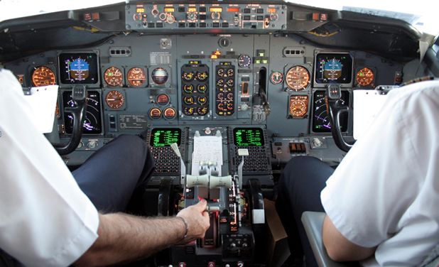
In safety critical applications like a flight deck, it is very important that the design of the interface support the pilots’ shared understanding of the flight environment as well as each others’ intentions and actions, rather than hinder it.

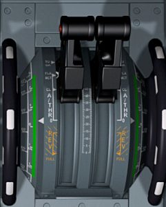
Another example of the interface hiding feedback from pilots is the design of the auto-thrust feature. Similar to cruise control in a car, the engine thrust is adjusted automatically to keep the plane at a particular speed, however the adjustments are not reflected by the position of the controls. Again, pilots do not have the tangible feedback from the levers that they had in the past.
According to the article, Airbus defends these changes as part of their design philosophy. Boeing, on the other hand, has a busy and cluttered cockpit interface where every control is manual, despite being electronically managed behind the scenes. The manual controls provide a tangible interface, and even move the levers to reflect automatic adjustments.
This story shows us that that even the smallest change in such a safety-critical interface can have disastrous effects. This doesn’t mean that changes can’t be made but that, as engineers, we need to take into consideration the cognitive load our designs place on users, and in this case, on the distributed cognition of the whole scenario.
Human-Computer Interaction in Your Car

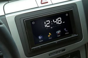
More and more, apps and touchscreens are being incorporated into our car dashboards, and without this sort of analysis, it’s only a matter of time before the accident rate starts rising.
While driving, I much prefer the tactile dash interface that allows me to change radio stations or operate the air conditioning without so much as a glance, to the touchscreen interface on my phone when I change a song or try to answer it.
What about you? Have you felt the cognitive strain of trying to handle newer, more complex interfaces while driving? Do you think design should ever be placed above safety?

